订阅AI通讯
您的数据完全安全。我们不会与任何人共享。
Free online chart maker tool to create professional charts and graphs from CSV data. Easily visualize your data with various chart types including line charts, bar charts, pie charts, scatter charts, radar charts, and more. Start making your charts online today!

A chart is a graphical representation of data that helps visualize complex information in a simple, understandable format. Charts transform raw numbers and statistics into visual patterns, making it easier to identify trends, comparisons, and relationships within data.
Why Use Charts?
Better Understanding: Visual information is processed 60,000 times faster than text by the human brain
Effective Communication: Charts simplify complex data into clear, digestible visuals
Quick Analysis: Patterns and trends become immediately apparent through visual representation
Professional Presentation: Charts add credibility and professionalism to reports and presentations
Types of Charts and Their Uses
Line Charts
Perfect for showing trends over time and continuous data series. Commonly used for stock prices, temperature changes, and growth metrics.
Bar Charts
Ideal for comparing quantities across categories. Excellent for sales comparisons, survey results, and ranking data.
Pie Charts
Best for showing proportions and percentages of a whole. Great for market share analysis and budget breakdowns.
Scatter Plots
Useful for showing relationships between variables. Often used in scientific research and statistical analysis.
Best Practices for Chart Maker
Choose the Right Type: Select a chart type that best suits your data and message
Keep it Simple: Avoid cluttering your chart with unnecessary elements
Use Clear Labels: Make sure axes, titles, and legends are easily readable
Maintain Consistency: Use consistent colors and styles throughout your charts
Choose Chart Type
Select the most suitable chart type from our variety of options based on your data characteristics and presentation needs. Each chart type has its specific use case:
Line Charts - Best for showing trends in continuous data
Bar Charts - Ideal for comparing values between different categories
Pie Charts - Perfect for showing part-to-whole relationships
Scatter Plots - Suitable for analyzing correlations between variables
Prepare Your Data
Organize your data in CSV format:
First row as headers, defining column names
First column typically for data labels (e.g., time periods, category names)
Ensure consistent data format, avoid mixing text in numeric columns
Month,Sales,Profit
Jan,1200,300
Feb,1400,350
Mar,1100,280
Upload Data
Click the "Upload CSV File" button and select your prepared CSV file:
Supports .csv file format
Recommended file size under 1MB
Ensure UTF-8 encoding for proper character display
Adjust and Optimize
Fine-tune your chart based on the preview:
Choose an appropriate color scheme
Adjust chart dimensions and proportions
Add titles and legend descriptions
Show or hide data labels as needed
分享实用笔记,帮助他人评估此工具。
暂无评论。开始对话吧。


探索精心挑选的 Codex 皮肤,保存收藏,并在 macOS 或 Windows 上自定义 Codex 桌面版,同时保留原生 UI。

NanoBananaAI 是一款由 Nano Banana Pro(谷歌先进图像模型)驱动的免费 AI 图像生成器。通过自然语言提示词,创建、编辑和转换令人惊叹的视觉效果,无需设计技能。

通过想法或脚本生成无脸短视频。在生成前检查吸引点、配音、视觉、字幕和场景规划。
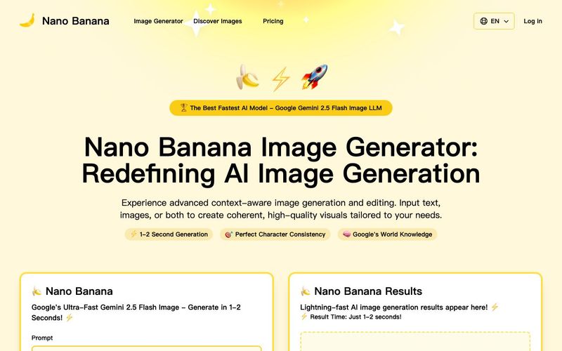
Discover Nano Banana, the next-generation multimodal model for context-aware image generation and editing. Combine text and image prompts to create, edit, and refine visuals with unmatched consistency and style.


Flux 2 Max 是 Flux 2 系列中最先进的版本,专为追求高精度、真实感和生产级视觉输出的创作者而设计。作为一款高端的 AI 图像生成器(AI Image Generator) 与强大的 AI 图像编辑器(AI Image Editor) 的结合体,Flux 2 Max 将图像质量与一致性提升到了全新高度,非常适合专业级创作流程。
随着人工智能的飞速发展,11月成为了全年最具突破性的月份之一。从新一代图像模型和令人惊叹的视频工具,到能够编写代码、构建应用程序、清理杂乱数据,甚至从零开始创建完整学习中心的 AI 助手,应有尽有。无论你是创作者、营销人员、学生、开发者,还是仅仅是一位人工智能爱好者,本月的种种新发现都会让你重新思考人工智能的无限可能。
2025年最佳AI大模型与AI工具,最受欢迎的免费AI大模型与AI工具。

With the launch of the iOS 18.1 Beta version, registered developers can now experience some of the features of Apple AI, a cutting-edge addition to AI tools.