AIニュースレターを購読
あなたのデータは私たちと完全に安全です。誰とも共有しません。
Free online chart maker tool to create professional charts and graphs from CSV data. Easily visualize your data with various chart types including line charts, bar charts, pie charts, scatter charts, radar charts, and more. Start making your charts online today!

A chart is a graphical representation of data that helps visualize complex information in a simple, understandable format. Charts transform raw numbers and statistics into visual patterns, making it easier to identify trends, comparisons, and relationships within data.
Why Use Charts?
Better Understanding: Visual information is processed 60,000 times faster than text by the human brain
Effective Communication: Charts simplify complex data into clear, digestible visuals
Quick Analysis: Patterns and trends become immediately apparent through visual representation
Professional Presentation: Charts add credibility and professionalism to reports and presentations
Types of Charts and Their Uses
Line Charts
Perfect for showing trends over time and continuous data series. Commonly used for stock prices, temperature changes, and growth metrics.
Bar Charts
Ideal for comparing quantities across categories. Excellent for sales comparisons, survey results, and ranking data.
Pie Charts
Best for showing proportions and percentages of a whole. Great for market share analysis and budget breakdowns.
Scatter Plots
Useful for showing relationships between variables. Often used in scientific research and statistical analysis.
Best Practices for Chart Maker
Choose the Right Type: Select a chart type that best suits your data and message
Keep it Simple: Avoid cluttering your chart with unnecessary elements
Use Clear Labels: Make sure axes, titles, and legends are easily readable
Maintain Consistency: Use consistent colors and styles throughout your charts
Choose Chart Type
Select the most suitable chart type from our variety of options based on your data characteristics and presentation needs. Each chart type has its specific use case:
Line Charts - Best for showing trends in continuous data
Bar Charts - Ideal for comparing values between different categories
Pie Charts - Perfect for showing part-to-whole relationships
Scatter Plots - Suitable for analyzing correlations between variables
Prepare Your Data
Organize your data in CSV format:
First row as headers, defining column names
First column typically for data labels (e.g., time periods, category names)
Ensure consistent data format, avoid mixing text in numeric columns
Month,Sales,Profit
Jan,1200,300
Feb,1400,350
Mar,1100,280
Upload Data
Click the "Upload CSV File" button and select your prepared CSV file:
Supports .csv file format
Recommended file size under 1MB
Ensure UTF-8 encoding for proper character display
Adjust and Optimize
Fine-tune your chart based on the preview:
Choose an appropriate color scheme
Adjust chart dimensions and proportions
Add titles and legend descriptions
Show or hide data labels as needed
実用的なメモを共有し、他の人がこのツールを評価するのを助けましょう。
まだコメントはありません。会話を始めましょう。


厳選されたCodexスキンを探索し、お気に入りを保存して、macOSまたはWindowsでCodex DesktopをネイティブUIを保ったままカスタマイズできます。

NanoBananaAIは、Googleの高度な画像モデルであるNano Banana Proを搭載した無料のAI画像生成ツールです。自然言語のプロンプトで美しいビジュアルを作成、編集、変換できます。デザインスキルは不要です。

アイデアまたは台本からフェイスレスリールを作成。生成前にフック、ナレーション、映像、字幕、シーン計画を確認できます。
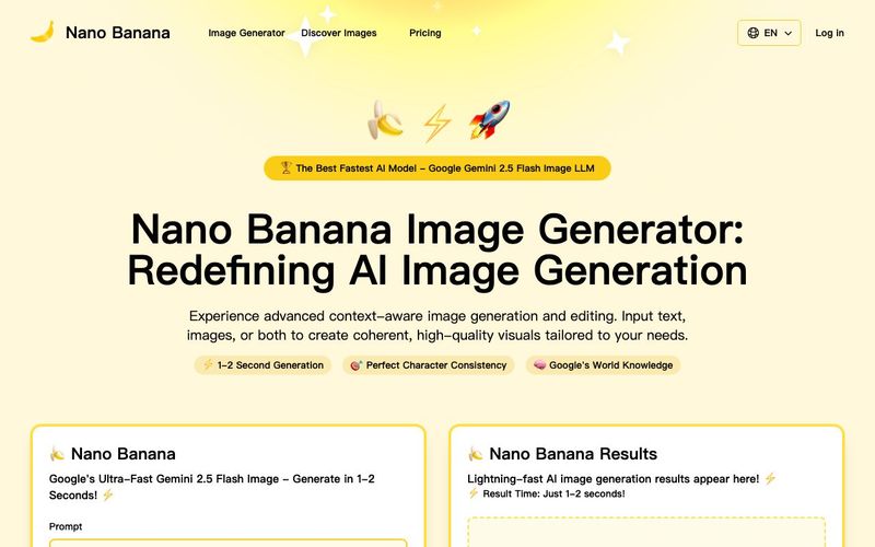
Discover Nano Banana, the next-generation multimodal model for context-aware image generation and editing. Combine text and image prompts to create, edit, and refine visuals with unmatched consistency and style.



This comprehensive guide explores the best AI image generators available in 2026, highlighting their unique features, strengths, and ideal use cases. We'll dive deep into each tool's capabilities to help you identify which AI image generator best suits your creative needs.

Google has just launched a powerful AI IDE code editor — now you can really vibe while coding
The best AI Model And AI Tools in 2026,The Most Popular Free AI Model And AI Tools.